

Why is it that small business gets a bad wrap for bad design? Probably because most small businesses can’t afford good marketing and try to do it themselves. Here is some life experience I would like to share with you–
One time, I thought that if I bought all of the supplies to build a table, I would save so much money and I could customize my table to look just how I wanted it to look. I had the plans all ready, I bought the perfect stain for the wood, and beautiful galvanized pipes (I was going for the “industrial chic” look). Once I purchased everything I needed, I had already spent about $80. Okay, so maybe I wasn’t going to save a ton of money, but at least my table would look exactly how I wanted it to look.
Once I stained the wood the perfect color, I tried attaching the pipes. Okay, so apparently you need these extra parts called “flanges” to make this part work. Not only did I not have the flanges, but I also didn’t have the screws or screwdriver. My custom money-saving table was actually just a piece of stained wood that couldn’t stand up right.
The lesson? I AM NOT A FURNITURE BUILDER.
If I really wanted a piece of custom furniture, I should have hired somebody to build it for me. Honestly, it probably would have cost me about the same amount of money and saved me a lot of headache. Plus I would actually have a nice table that I could use instead of all of the parts sitting in my garage.
I’ve applied this lesson to other parts of my life, including my business. This is why we are Columba Collaborative. Even though I consider myself a “creative,” my strong suit is design. I’m not great at writing copy, photography, web hosting, developing, etc.
If you own a business, chances are you are really good at something. If you are really good at making cupcakes, the world needs to know how good you are at making cupcakes. Right now, the world lives on the internet, so take advantage of the massive exposure you will receive when you market yourself online!
Check out these beautifully designed small business websites for some inspiration.
Spyhouse Coffee, MN
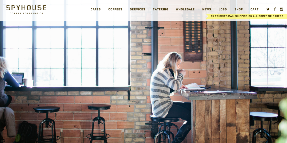
Spyhouse Coffee is a coffee shop and roastery in the Twin Cities. Their website features a beautiful slider on the landing page, and a photo feed from their instagram. This website is photographically driven, which really piques a user’s interest. Not only does this website utilize photography, but they utilize GOOD photography. Each photo is planned, staged, and edited. Notice how they don’t just snap an iPhone photo and call it good. Also notice how this website uses the whitespace so tastefully. The whitespace on their page helps direct the eye to what is important on the page, and everything always comes back to their product.
Restore Austin, TX

First off, let’s talk about the logo. Legible? Yes. Interesting? Yes. Unique? No doubt.
You absolutely want your brand to stick out in all of the marketing muck out there. This logo does that. As for the website, it is simple and easy to navigate, which is super important (espically for a non-profit). When you scroll down the home page, you see a professionally produced video that clearly shows what this non-profit is about. Past that, you will see a band at the bottom of the page with banners that link to each of their pages. SO SIMPLE. Think about the older generations visiting this website (trust me, they are out there). There is no confusion, only a few pages with good content, and they have integrated their social media into their site. Take notes about the navigation on this site, this is good stuff.
design by 5Nineteen Design
Heirloom Bakery, OK

I know I’ve been talking mostly about design, but above all, a website has to be functional. When great function meets great form, that is good design. Heirloom Bakery in Tulsa has a great design. This seems intuitive, but why do you visit a website for a restaurant? To see the menu. How frustrating is it when you pull up a website that has just linked a PDF to their website for their menu and it isn’t optimized for a phone? Or the menu shows the food, but not prices? Or the menu doesn’t specify gluten free and vegetarian options? Heirloom has made their menu SO easy to access and so beautiful to look at. Remember what I was saying about the tasteful white space? This website has it. Not to mention their beautiful photos.
Power Life Yoga, IA
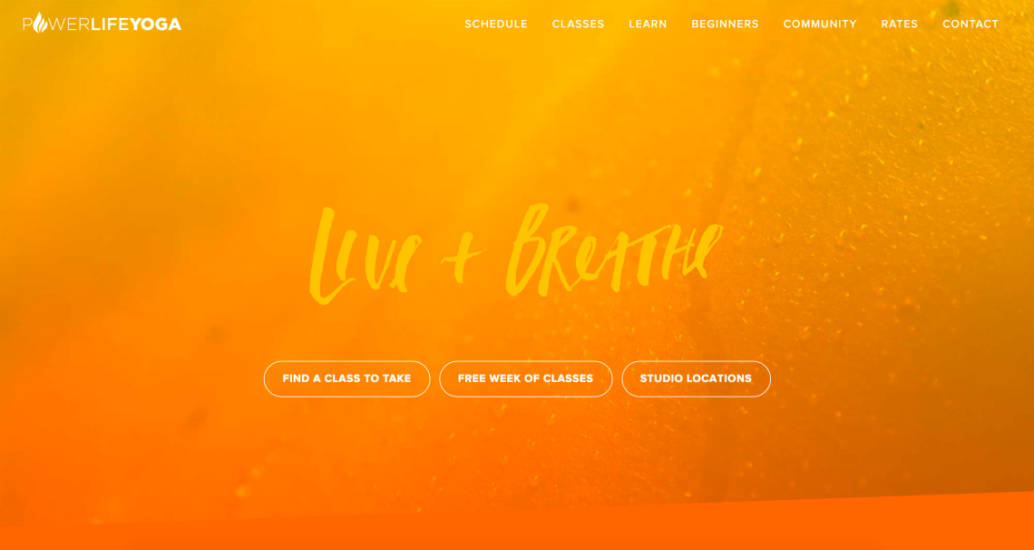
How perfect is this script font? The bright colors and the hand written font bring a sort of playfulness to the site that is perfect for the subject matter. The logo is professional, but the website design pairs nicely to bring some more personality to the brand. Have you noticed that most of the sites that I am showing you have this simple format with large images and easy navigation? That’s because it just works. Not only does this website tell you about the classes offered, but it also helps the user connect with the local community and learn about what one might experience in a yoga class. This is a very successful website design because yogis and non-yogis alike can find exactly what they are looking for.
design by Happy Medium
I love discovering new and beautiful websites, so comment below if you have any recommendations!

